The last two three days have been pretty annoying, especially as it now turned out that I’ve managed to overlook the all too obvious and instead run in the wrong direction all along (yes, I’m just a little annoyed about myself and so much wasted time)
As I noticed much too late, the frame sizes used in the Black Gate and Serpent Isle fonts are different.
The fonts in BG and SI are the same size, but the size of the frames used for the font in BG (18×20 pixel) is 33% higher than in SI with 14x20px. This results in a considerably larger line spacing in BG compared to SI.
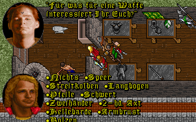
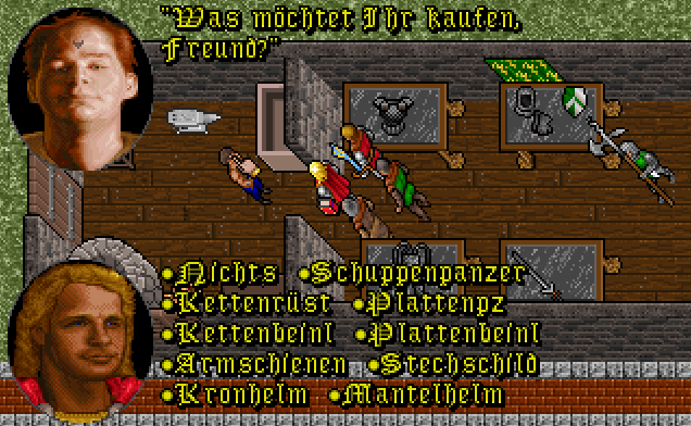
Today I have added German umlauts to SI’s original Fraktur font, but it was only moderately successful: the height of 14 pixels is unfortunately the absolute minimum height this font needs, i.e. the large umlauts simply don’t have room to put points above it. Accordingly, I had to move the capital letters one pixel down. Accordingly awkwarf it looks unfortunately:

Bringing the modern font to the 14×20 pixel format is even more effort, something I really shy away from at the moment: the Antigua font has some letters that are higher than the available space.
Unfortunately, all of the above alone was not enough to make the dialogue with Standarr completely readable again. I still had to use some abbreviations because the German names were simply too long:


